-
-
Instructions: Click on the pixel dimensions to view actual pixels. To use an image as your desktop background, right click on the image and click on 'Set As Background' or 'Set As Wallpaper.' (These options vary with different browsers).
Please review the Terms and Conditions before proceeding. By law, use of this website signifies your understanding and agreement to these terms.-
Do not redistribute
(i.e. re-upload or post on community/other websites, such as deviantart etc). -
Do not modify or make graphics out of any of these works
(i.e. avatars/signatures/layouts/etc). - Wallpapers are for personal use as desktop wallpapers only.
- For FAQs regarding theJADEDnetwork Wallpapers, please click here.
Proxy
Details
Download
Square (5:4 Ratio) 1600x1280 1280x1024 Standard (4:3 Ratio) 1280x960 1024x768 800x600 Widescreen (16:10 Ratio) 1280x800

Juan @ Saturday, January 29, 2011 -- 9:20 pm
Awesomee, awesome, awesome, I don0t have any word, for this picture! ;D thanks!!!!!
TRUPERâ„¢ @ Wednesday, March 25, 2009 -- 10:22 am
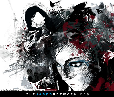
wow.. great artwork! It fits her personality and her crazy life.. its like what is going on in her mind.. great colors and words/letters.. i saw anbuu's mugen.. yes in comparison its similar in "category" but in style.. i think yours is deeper/meaningful.. maybe im just looking more in psychological element.. nevertheless.. great art piece..
TRUPERâ„¢
Tiffany @ Friday, February 13, 2009 -- 7:23 pm
When I first came across this piece of work, I thought immediately "Wow, just....wow." I like the work in its resized form more than I do its widescreen form, for some reason I can't articulate. The colors are really lovely here together and the sketchy style with the vectors blending together are just fantastic. Props for this amazing piece. I haven't been on the look out for talents on the web lately, and am lucky to have come across your site. Chock full of goodness everywhere. :) Keep up the good work.
P.S. If you don't mind me asking, what was the font that you used for this piece? I've been looking for a good basic san serif font for a while, and yours seems to be almost what I'm looking for. Any pointers to help me in the right direction would be greatly appreciated.
Thank you very much for your comment :). I'm very glad to know you enjoy my work. I think I can understand the widescreen sentiment, as I actually like this one better too without the mouth (the expression seems more intense).
The fonts I used are:
Eurostile
Century Gothic
Bank Gothic
Copperplate Gothic Light
Cheap Pizza (this one is the weird scribbly "ergo" above the white "proxy" text)
Orator Std
Futura (used on the signatures)
They are all downloadable online (just google for them and you should find them).
metal-allan @ Friday, February 6, 2009 -- 2:06 pm
merci
-
Do not redistribute
-
 Copyright © 2026 theJADEDnetwork.Com
All Rights Reserved
Use of this Site and/or any of its materials signifies
user agreement to the TJN Terms and Conditions


